
UX Audit and Redesign:Uber Driver App
Project Overview
This project focuses on auditing and improving the user experience of the Uber Driver app. Through extensive testing, driver interviews, and user reviews, I identified key usability issues that affect drivers’ efficiency and satisfaction. I then redesigned critical features to simplify navigation, improve visibility, and streamline drivers’ daily interactions with the app.
Phase 1: Research Process
To understand real driver pain points, I combined:
Personal usability testing on the existing app
Interviews with active Uber drivers
Analysis of user reviews from the App Store and Play Store
This approach helped uncover consistent frustrations and usability challenges that negatively impacted driver experience.


Key Findings and Redesign Solutions
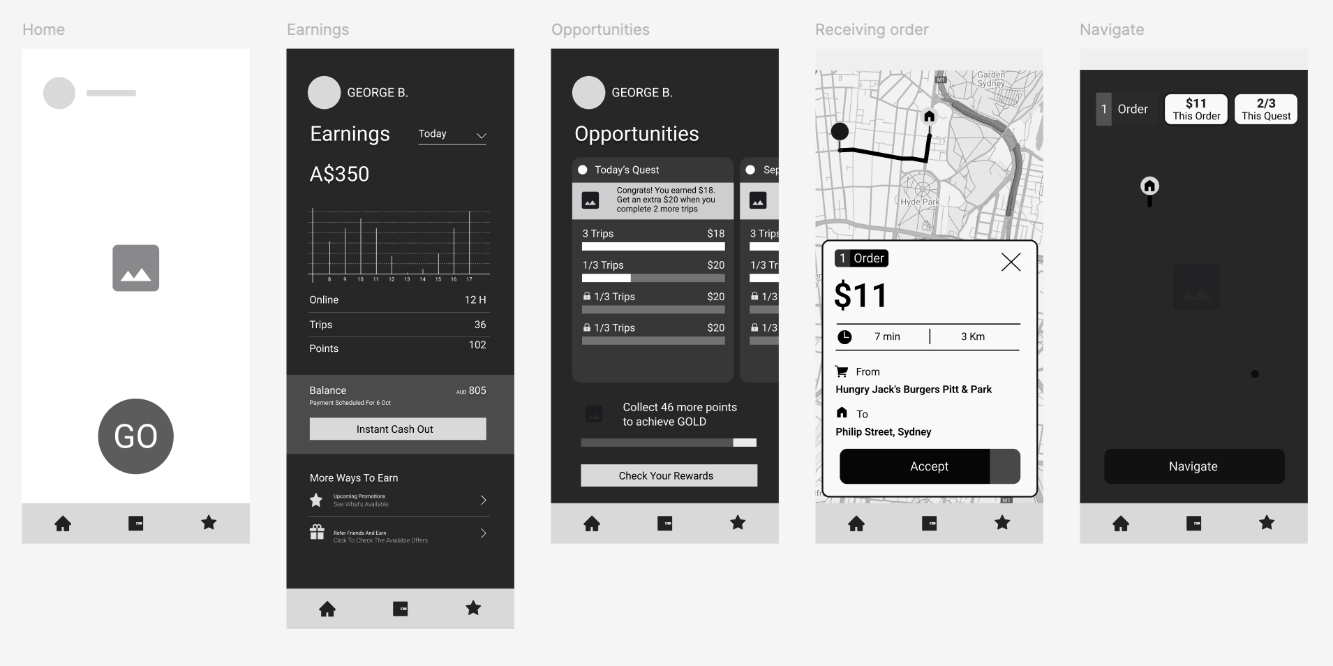
1. Complex Navigation & Unclear Icons
Problem:
Drivers had to make too many clicks to reach essential features. Many icons were ambiguous, forcing users to tap them just to discover what they do.
Solution:
I introduced a fixed bottom navigation bar with clearly labeled icons and consistent placement across all pages. This minimizes clicks and creates a predictable, intuitive structure for navigation.
2. Limited Earnings Overview
Problem:
The earnings page only displayed weekly income, making it difficult for drivers to track performance trends.
Solution:
I added a filter system allowing drivers to view earnings by today, yesterday, this week, or this month.
All content on this page now focuses solely on earnings, while quests and driver status were moved to a dedicated Opportunities section.
3. Ineffective Inbox Section
Problem:
Most drivers ignored the inbox since messages were irrelevant or repetitive. It created unnecessary clutter without providing real value.
Solution:
I removed the inbox section entirely. Important communication from Uber is now accessible only through the Help section when drivers contact support, simplifying the interface and reducing distractions.
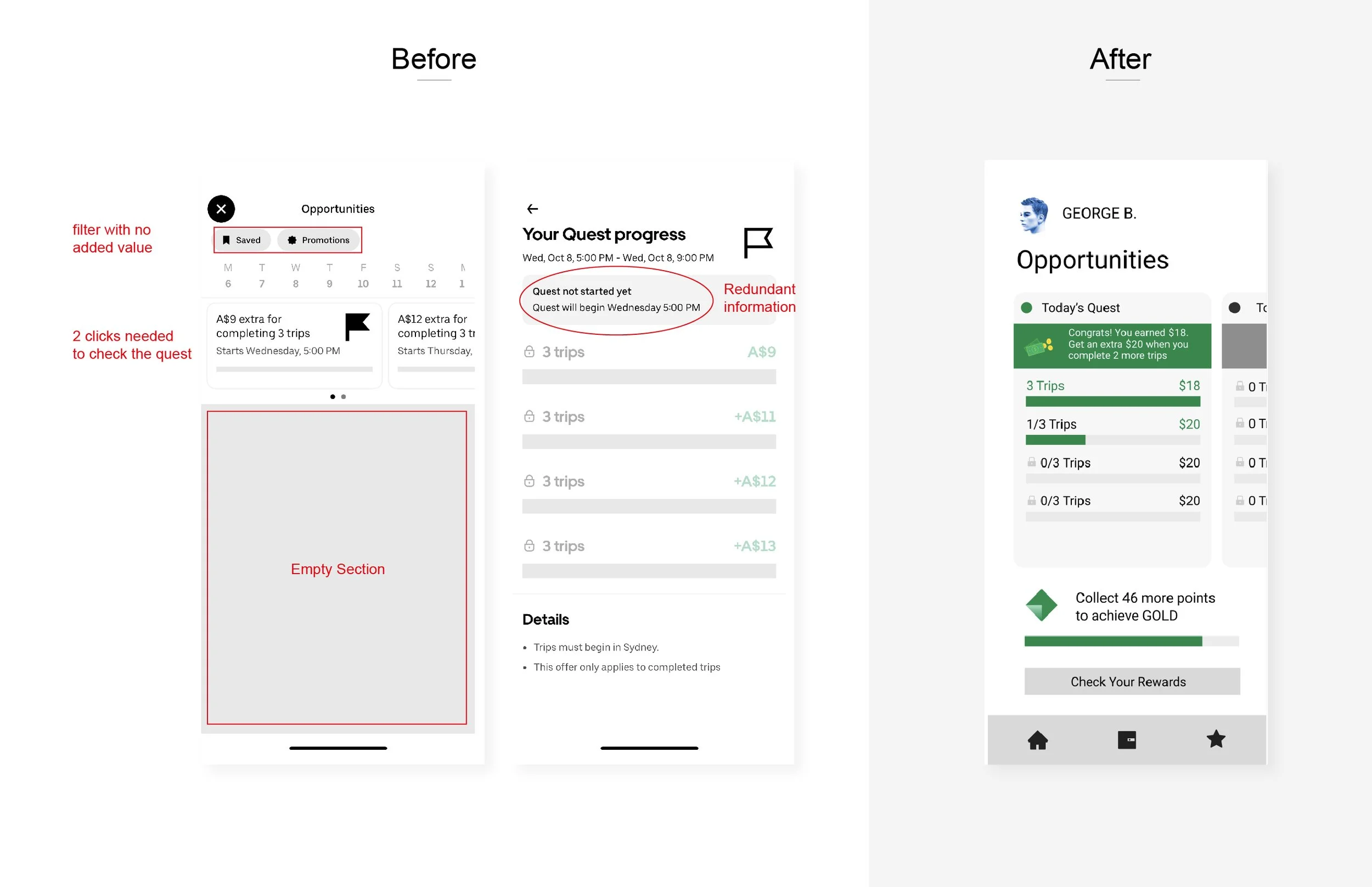
4. Hidden and Confusing Quest Section
Problem:
The Quest section changed location depending on whether the driver was online or offline, making it difficult to access. Viewing multiple quests required too many clicks.
Solution:
I redesigned this section to be always accessible, regardless of online status.
Drivers can now flip between quests horizontally to view details quickly, without extra clicks. I also added a driver status bar (Green, Gold, Platinum, Diamond) below for instant visibility.
5. Unclear Order Information
Problem:
When receiving a trip request, the displayed information (number of orders, distance, and time) was poorly structured and hard to interpret at a glance.
Solution:
I improved the layout of incoming trip notifications, using clearer typography and visual hierarchy so drivers can instantly understand all key details before accepting a ride.
6. Hidden Quest Access During Orders
Problem:
Once a driver accepted an order, they couldn’t easily access their quest progress. They had to drag the top header and click multiple times to reach it.
Solution:
I added fixed, visible buttons on the map screen, allowing drivers to view active quests or offers instantly without interrupting their trip workflow.
Outcome
The redesigned experience focuses on clarity, speed, and simplicity.
By eliminating unnecessary steps and restructuring key sections, drivers can now manage rides, track earnings, and access opportunities with minimal effort.