
Boost
Phase 1: Brand Audit
Understanding Where We Started
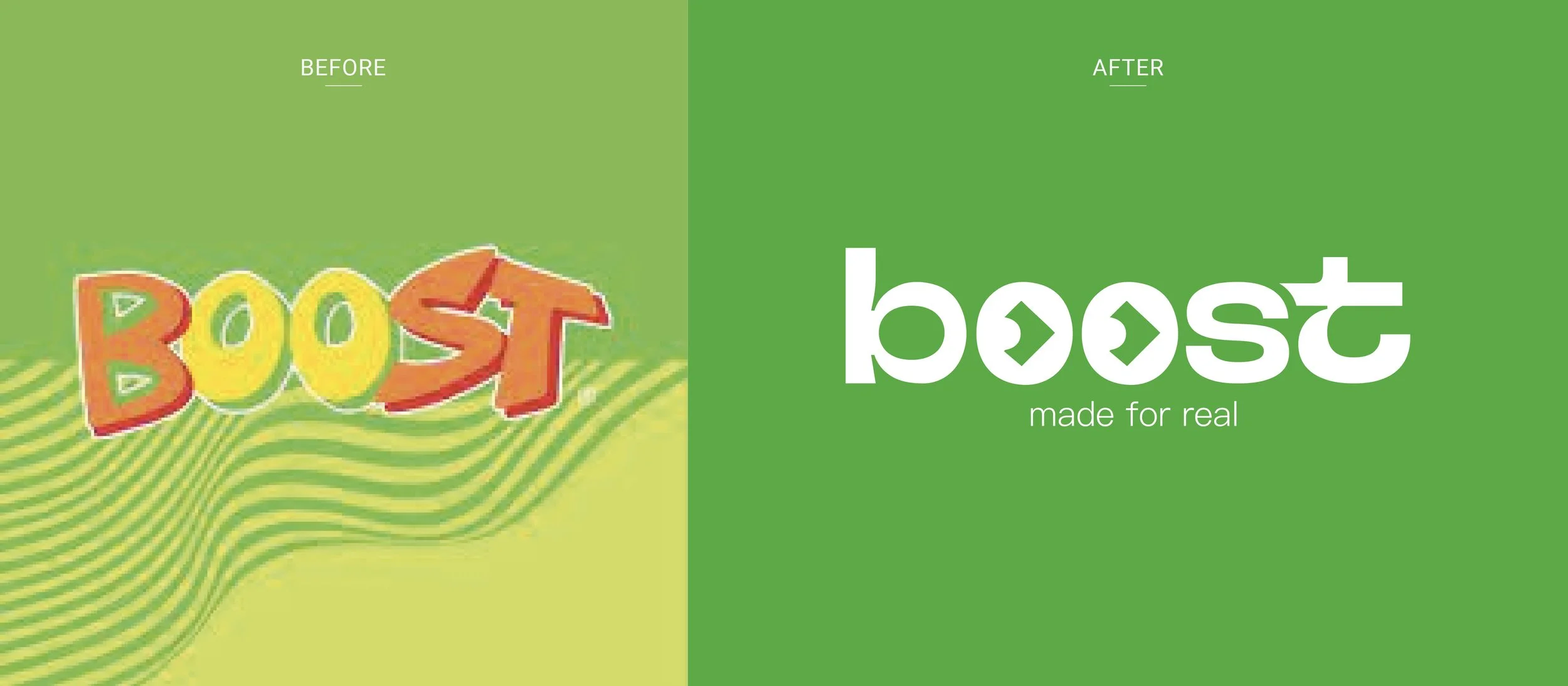
The original Boost Juice identity had served the brand for many years, but it had become outdated and inconsistent with today’s market expectations. The previous logo felt childish, visually weak, and lacked a sense of direction, failing to communicate the brand’s dynamic and health-driven ethos. Visual assets—signage, uniforms, packaging—were fragmented and did not create a cohesive or impactful brand experience.

Phase 2: Research & Strategy
A thorough market and consumer research phase followed:
Market Analysis: Studied leading juice and smoothie competitors in Australia and globally.
Consumer Insights: Explored customer perceptions of Boost, their emotional connection, and desired improvements.
Strategic Direction: Defined a new brand essence built around freshness, movement, and modern vitality.
The strategy aimed to keep the brand recognisable but make it relevant for a new generation of health-conscious, fast-moving consumers.
Phase 3: Brand Evolution
The brand evolution was not about a full departure, but a strategic transformation:
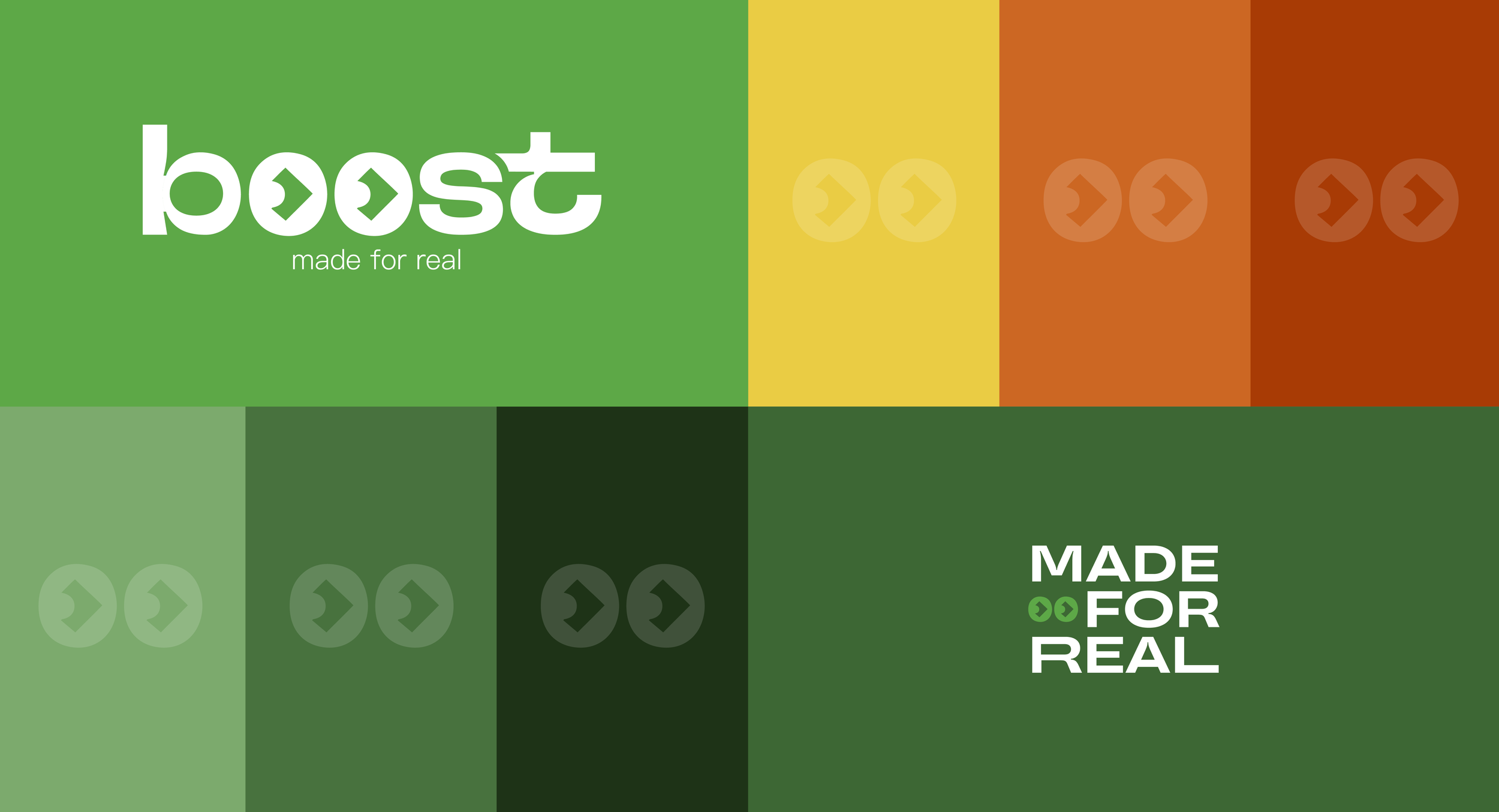
Logo Redesign: The new logo is bold, minimal, and directional. The double “o” became two arrows forming eyes, symbolising “boosting forward,” aligning with the brand promise of energy and momentum.
Color Palette: Shifted to brighter, fresher greens with a modern secondary palette, reflecting natural ingredients and vitality.
Typography & Visual Language: Modern, clean, and flexible, with flat illustrative elements and overlapping fruit motifs.


Phase 4: Execution
The rebrand was rolled out across all touchpoints:
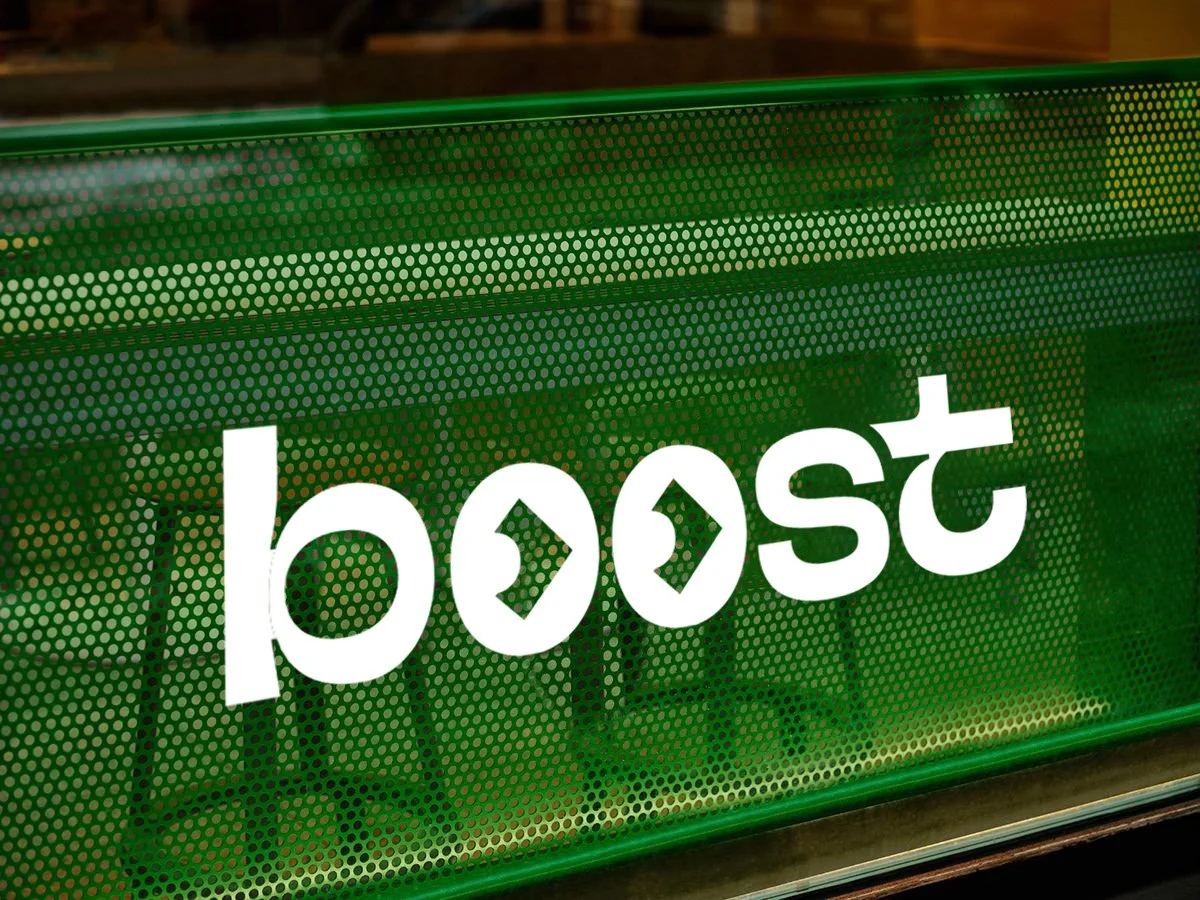
Signage & Shopfronts: Clean, fresh, and contemporary layouts, increasing visual impact in shopping centres.
Packaging & Bags: Reusable bags with layered green fruit illustrations; minimal yet expressive.
Uniforms: Updated to reflect the new energy of the brand—vibrant yet professional.
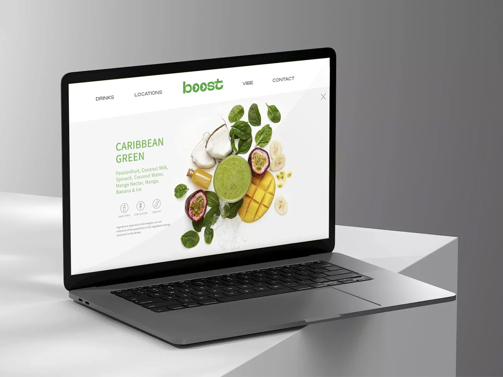
Digital & Print Assets: Consistent application across social media, loyalty cards, menus, and promotional materials.
Results & Takeaways
Customer Perception: Early feedback showed an immediate shift toward perceiving Boost as a modern, forward-thinking health brand.
Visual Impact: The new identity increased in-store visibility and created a cohesive experience across touchpoints.
Brand Alignment: Boost’s mission to energize and refresh now has a visual identity that matches its promise.